Quality Brochure Design
There are a lot of tools available to promote your goods or services. Despite the significance of digita5 marketing, a high quality print brochure design should still be at the top of your list. This is especially true if your business ever requires person-to-person contact. A good brochure presents your business in an aura of sophistication and is a great giveaway. If the graphic design on your brochure is engaging it will sit around your prospect's car or home for weeks and months resulting in countless impressions. With that in mind, can you really afford not to order some brochures today?
Whatever your industry, Ortner Graphics has probably created a compelling brochure design for it in the past. Eric Ortner has spent 15 years creating quality brochure designs in New York City, Westchester, the Hudson Valley and Northern New Jersey. With this sort of experience you can be assured that a design will be created that matches both your budget and your audience's expectations.
Things to think about when creating a brochure design include the concept, size, number of pages, the type of fold, binding, paper, the number of colors and type of ink.
Overview of the Brochure Design Process
Your first decision will be the size of the brochure. Bigger isn't always better. A smaller brochure can create more of a boutique feel and will often times save you production costs because you can gang more of them up on a press sheet.
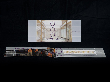
Your next decision will be the type of fold and binding. If your marketing budget is extensive, then you can create brochures with pocket folder covers, and die cut shapes with saddle stitched, pefect or spiral bound interior pages. On the other hand, if you are on a tight budget then perhaps you need a single sheet brochure. However, there are still ways to create a compelling design beyond the basic tri-fold. You might want to consider a gatefold or half fold brochure.
The third step in the brochure design process is organizing the content. There should be a specific flow to the brochure. Think about the steps in your business process. Many times this is the correct order in which to present your brochure's information. In most cases it is also important to keep the content brief. Dumping too much information into your brochure will most likely bore your prospective customers. You can alleviate this problem by including infographics in the design. Just as importantly, be sure to have a compelling cover that will engage your clients and make them open it up and read it.
With your content firmly outlined, it should be much easier to come up with a concept for your brochure. The concept will rely a great deal on the use of imagery. In most cases this will be photography. Sometimes, though, you may find that illustration will present the look and feel that you need. Regardless of the overall concept it is imperative that the design remains consistent throughout the brochure.
Your final step in the design process is determining materials and production methods. Once you have firmly established the direction you want to go in terms of concept, you can finally decide on things like the type of paper, the number of colors and the type of ink to use. If you have a large budget and are trying to create a sense of luxury perhaps you will require metallic inks, or foil stamps and velum overlays. If you are on a budget, maybe you just require two or four color printing on a nice quality, but affordable card stock.
When you're ready to create a new brochure, be sure overall that the final appearance is quality. You don't necessarily have to spend a fortune to leave a good impression. You just need to be sure to use the resources that you have available to their fullest capacity. Ortner Graphics experience in brochure design will make sure that your project's budget reaches its fullest potential. For more information and a free quoate fill out the form above or call 914-424-7160 today.

